Overview

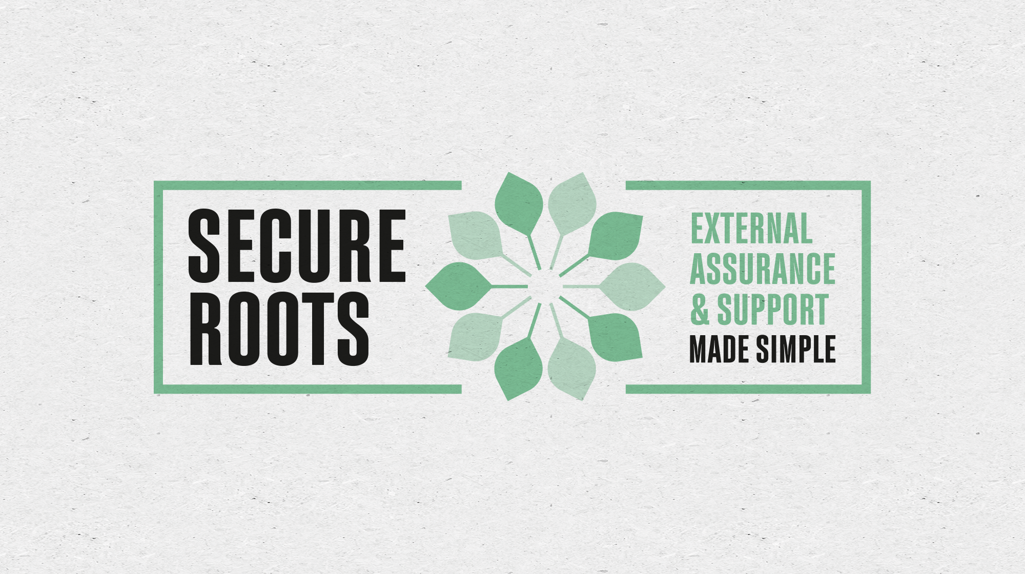
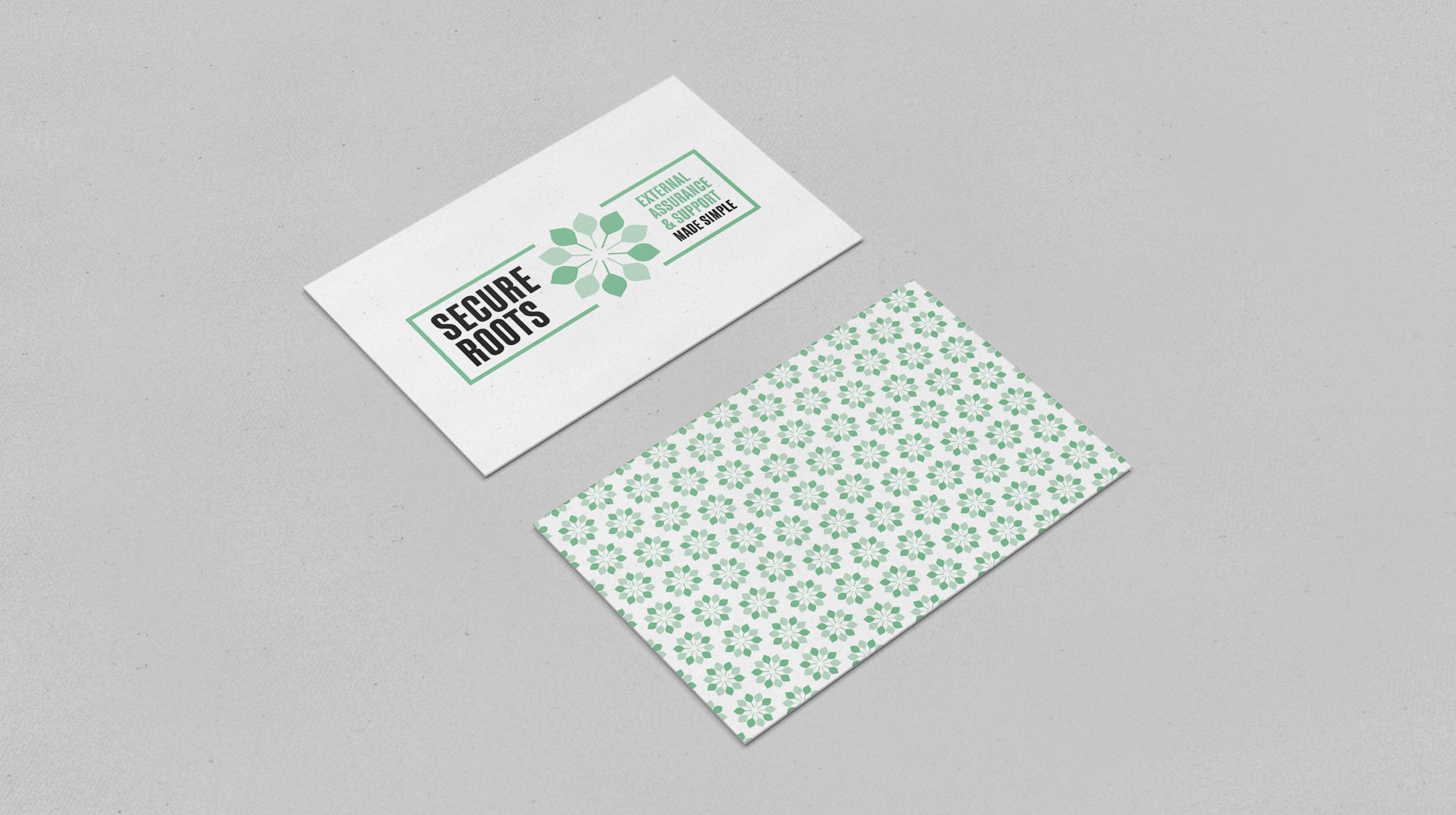
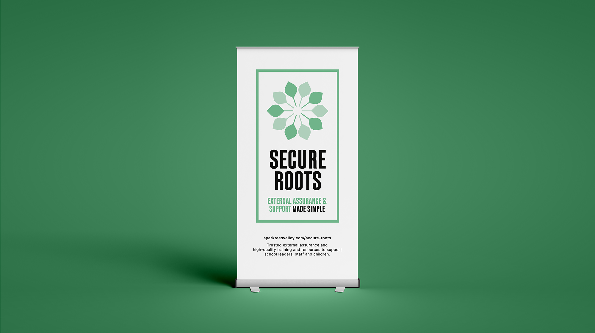
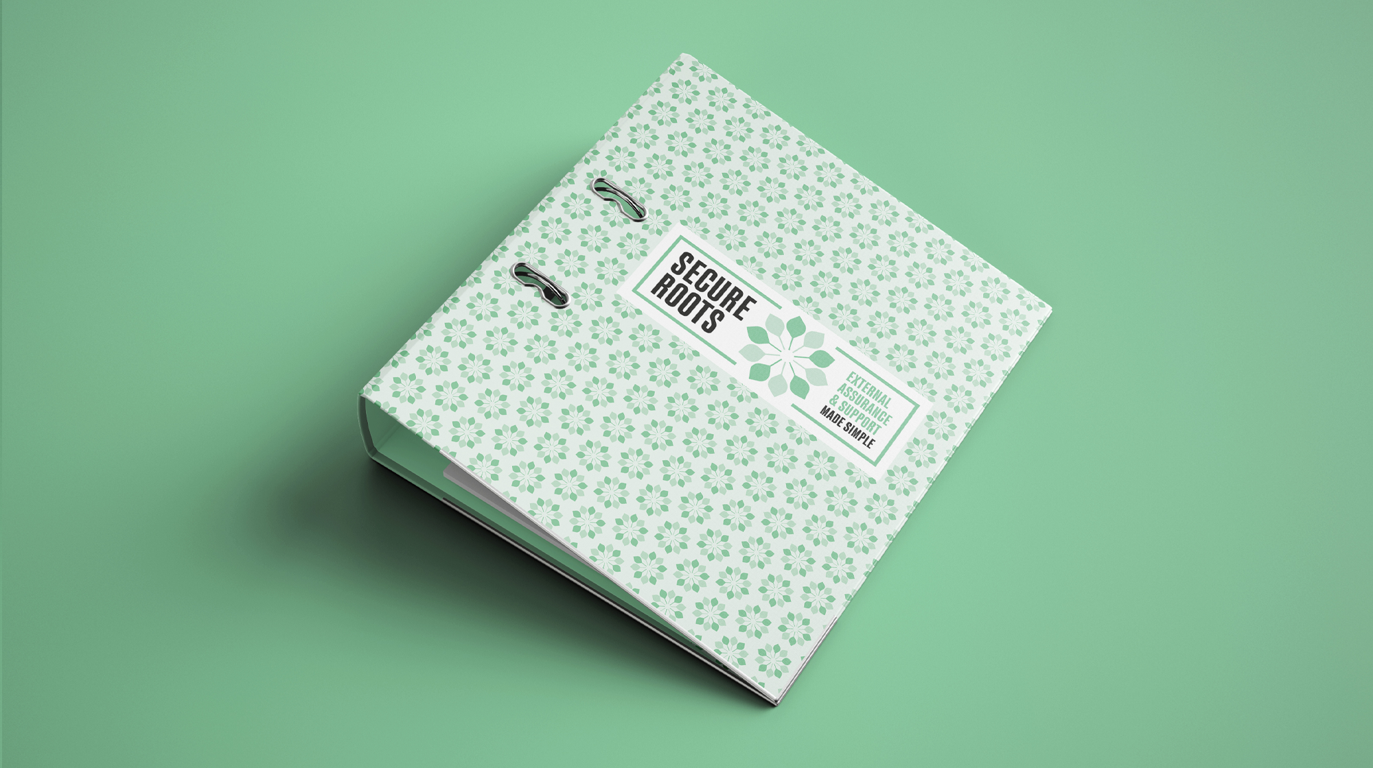
Having worked with Spark Tees Valley from the outset, we were delighted to support the team again as they looked to expand their service offering. With in-house expertise ready to deliver a new specialist service, Spark wanted to introduce it to market in a way that felt fresh while still benefiting from their established reputation. We worked closely with the team to develop a visual identity and messaging that aligned with the Spark brand whilst allowing the new service, Secure Roots, to stand confidently within it.

Details

Spark Tees Valley approached us with plans for a new service that would appeal to their existing client base. After discussion, we advised that the service would be best placed within the Spark Tees Valley brand to retain trust and recognition. We developed a complementary icon and visual identity for Secure Roots that aligns with the parent brand but stands strong in its own right. We also created clear, accessible packages and wrote audience focused copy to ensure the new service was positioned effectively.

Services

Brand strategy, identity design, copywriting