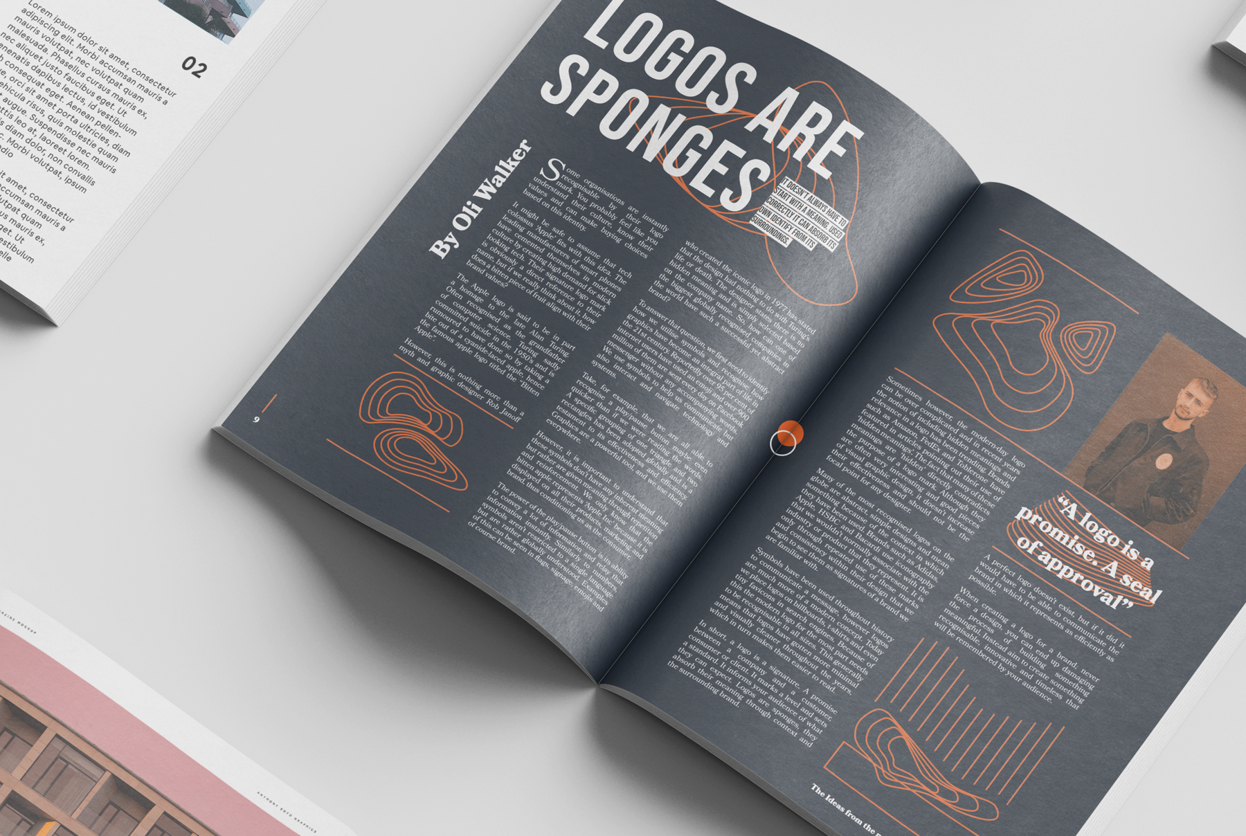
Some organisations are instantly recognisable by their logo mark. You probably feel like you understand their culture, know their values and can make a buying choice based on this identity.
It might be safe to assume that tech colossus ‘Apple’ fits with this idea. The leading manufacturers of smart phones have cemented themselves in modern culture by creating a high demand for slick looking tech. Their signature logo mark is obviously a direct reference to their name, but if we really think about it, how does a bitten piece of fruit align with their brand values?
The Apple logo is said to be in part a homage to the late Alan Turing, often recognised as the grandfather of computer science. Turing sadly committed suicide in the 1950’s and is rumoured to have done so by taking a bite out of a cyanide-laced apple, hence the famous apple logo titled the “Bitten Apple”.
However, this is nothing more than a myth and graphic designer Rob Janoff who created the iconic logo in 1977 has stated that the design had nothing to do with Turing’s life or death. The designer states there is no hidden meaning and is simply selected based on the company name. So, how can one of the biggest globally recognised companies in the world have such a successful yet abstract brand?
To answer that question, we first need to identify how we utilise symbols and recognise how graphics have become an integral part of life in the 21st century. Reportedly over 95 per cent of internet users have used an emoji and over 900 million of them are sent every day on Facebook Messenger without any accompanying words. We use symbols to help us communicate but also to interact and navigate with technology and systems.
Take, for example, that we are all able to recognise a play/pause button maybe even quicker than if we were reading the words. A specific grouping of one triangle and two rectangles has been adopted globally and is a testament to its effectiveness and efficiency. Graphics are a powerful tool, and we use them everywhere.
However, it is important to understand that these symbols don’t have any inherent meaning but rather are given meaning through repetition and reinforcement. We only know that the bitten apple represents ‘Apple Inc’ because it is displayed on all their products, marketing and brand, thus conditioning us as the consumer.
The power of the play/pause button is its ability to convey a lot of information and relay that information instantly. Similarly to numbers, symbols aren’t restricted to a single language but are rather globally understood. Examples of this can be seen in flags, signage, emojis and of course brand. Sometimes the modern-day logo can be over complicated and in recent years the notion of including hidden meanings and relevance in a logo has been trending. Brands such as Amazon, FedEx and Toblerone have featured in articles pointing out their use of ‘hidden meanings’. The fact that many of these meanings are ‘hidden’ directly contradicts the purpose of a logo mark. Although they are often very interesting and good pieces of visual graphic design, it doesn’t increase their effectiveness and should not be the focal point for any designer.
Many of the most recognised logos on the globe are abstract, simple designs and mean something because of the context in which they have been used. Brands such as Adidas, Apple, HSBC and Bacardi use iconography that we wouldn’t normally associate with the industry or product that they represent. It is only through repeated use of these marks and consistency within their design that we begin to see them as signatures of a brand we are familiar with.
Symbols have been used throughout history to communicate a message, however logos are much more of a modern concept. Today we place logos on billboards, t-shirts and even tiny favicons in search engines. Because of this, the modern logo for the most part needs to be recognisable in all sizes. This generally means that logos have gotten more minimal and visually cleaner throughout the years, which in turn makes them easier to read.
In short, a logo is a signature. A promise between a company and a customer, consumer or client. It marks a level and sets a standard. It informs your audience of what they can expect. Logos are sponges, they absorb their meaning through context and their supporting brand elements. A perfect logo doesn’t exist, but if it did it would have to be able to communicate the brand in which it represents as efficiently as possible.
When creating a logo for a brand never force a design, you can end up damaging the process of building something meaningful. Instead aim to create something recognisable that will stay distinct in the mind of your audience.
View double page spread here >


